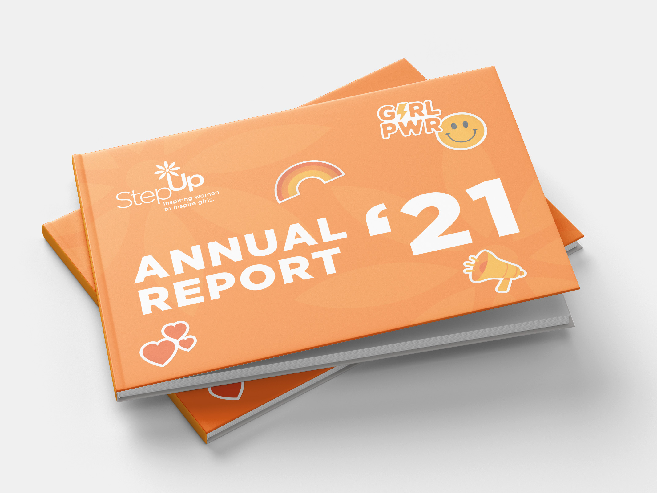
Flaks Studio was approached by Step Up, an organization that helps young women define and achieve their goals through structured programs and access to a strong community, to design its annual report. The objective was to create a design that captured the youthful spirit of Step Up’s members while being informative and engaging.
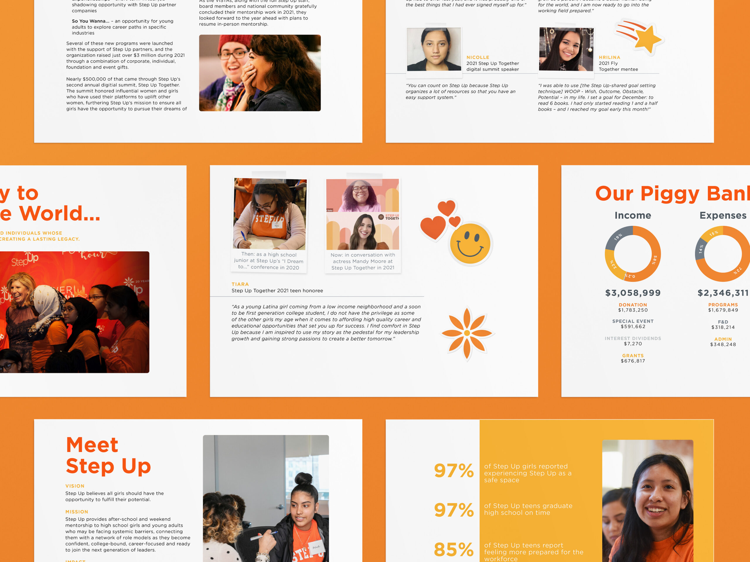
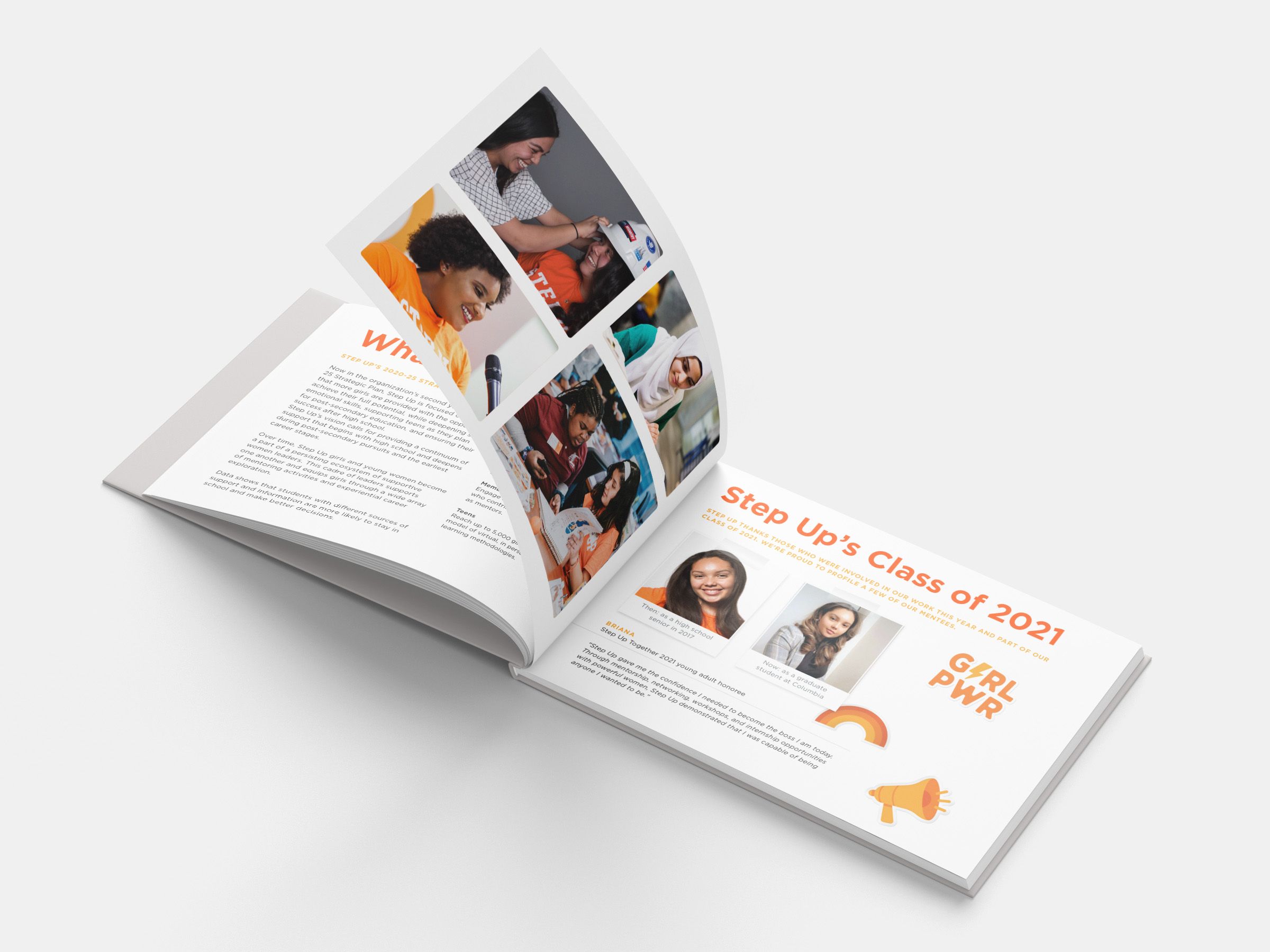
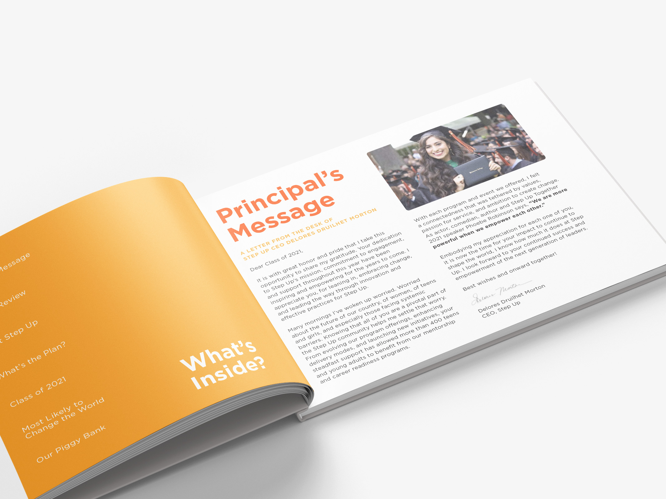
Our team had plenty of creative freedom, and we leaned into the visual concept of a high school yearbook for the report. The first priority was to ensure that the copy flowed well. Eye-catching headings and subheadings were paired with minimalistic body copy, creating vibrant and youthful pages that remained visually interesting even with heavy use of text.
In terms of color palette, Flaks Studio opted for a bright selection of warm colors. This choice aimed to captivate and retain the viewer’s attention as they flipped through the pages of the report.
To further enhance the yearbook theme and create a sense of personalization, Flaks Studio designed faux stickers that could be scattered throughout the report. These stickers added a playful and authentic touch, reminiscent of how students decorate their yearbooks. Additionally, images were laid out as polaroid snapshots, giving the impression that they had been hastily taped onto various interior pages. This design choice aimed to evoke a sense of nostalgia and human connection, as if a teenager had personalized the book themselves.
Overall, Flaks Studio’s design for Step Up’s annual report successfully captured the youthful spirit of the organization while effectively conveying information. The yearbook-inspired layout, vibrant colors, faux stickers, and polaroid snapshots all contributed to creating a grounded and relatable experience for the reader.


